Setting the Mood: How Colour Transforms the Feel of Your Home

When it comes to designing your home, colour is far more than a matter of style—it's a powerful emotional tool. From the cozy warmth of an earthy palette to the crisp energy of whites and blues, colour has the ability to shape the mood of a space and how we feel within it.

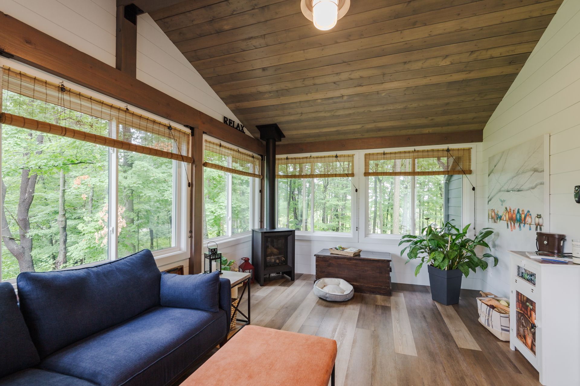
Warm Tones: Comfort and Coziness

Colours like red, orange, and yellow are often considered "warm" tones. These hues evoke feelings of warmth, comfort, and sociability. A burnt orange wall in the dining room can encourage conversation and appetite, while deep terracotta accents in a living space add an earthy richness that feels grounding. These tones are ideal for creating a welcoming atmosphere, especially in rooms meant for gathering and relaxation.

Cool Tones: Calm and Clarity

Blues, greens, and purples belong to the "cool" family. These colours are known to soothe and calm, making them perfect for bedrooms, bathrooms, or any space where you want to relax and unwind. A soft blue can make a room feel open and airy, like a breath of fresh air, while sage green brings a natural, restorative vibe. These tones also help in making smaller spaces feel larger and more serene.

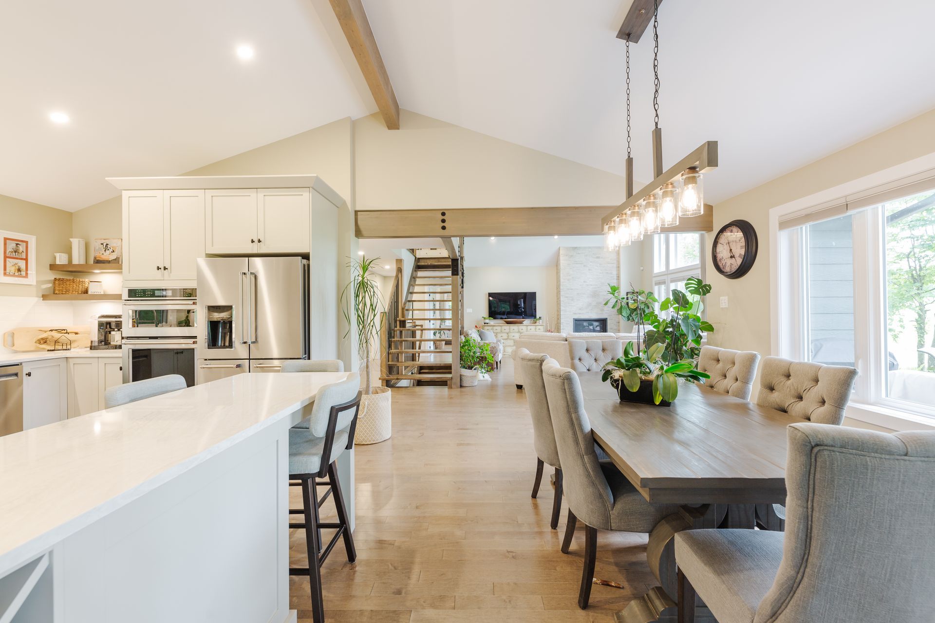
Neutrals: Versatility and Balance

Neutrals like white, beige, grey, and taupe offer versatility and timeless appeal. They act as a calming backdrop, allowing you to layer in colour through furniture, art, and accessories. A neutral palette is ideal for those who prefer subtlety and elegance. For instance, a light grey living room feels refined and composed, while still giving you the freedom to change the mood with pops of colour seasonally.

Dark Colours: Drama and Intimacy

Deep shades like navy, charcoal, and forest green create a mood of sophistication and intimacy. While often seen as bold choices, these colours can add incredible depth to a room. Used on walls or cabinetry, dark tones can make a space feel cozy and cocooned. Pairing them with lighter accents or metallics brings balance and prevents the space from feeling closed in.

Pastels: Softness and Cheer

Pastel hues - like blush pink, lavender, and baby blue - add a lighthearted and playful mood to any room. They work well in nurseries, bedrooms, or creative spaces where a touch of whimsy is welcome. Pastels can also be modern and chic when paired with contemporary furniture and clean lines.

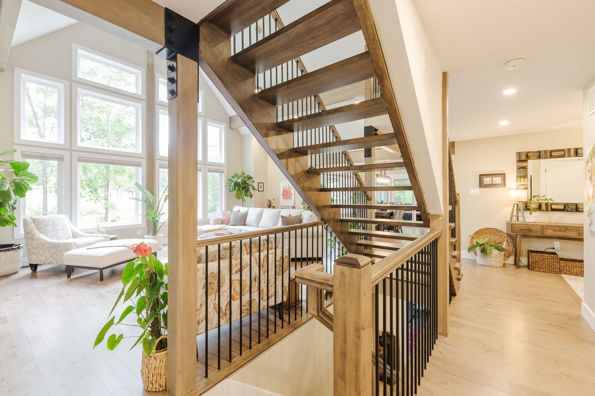
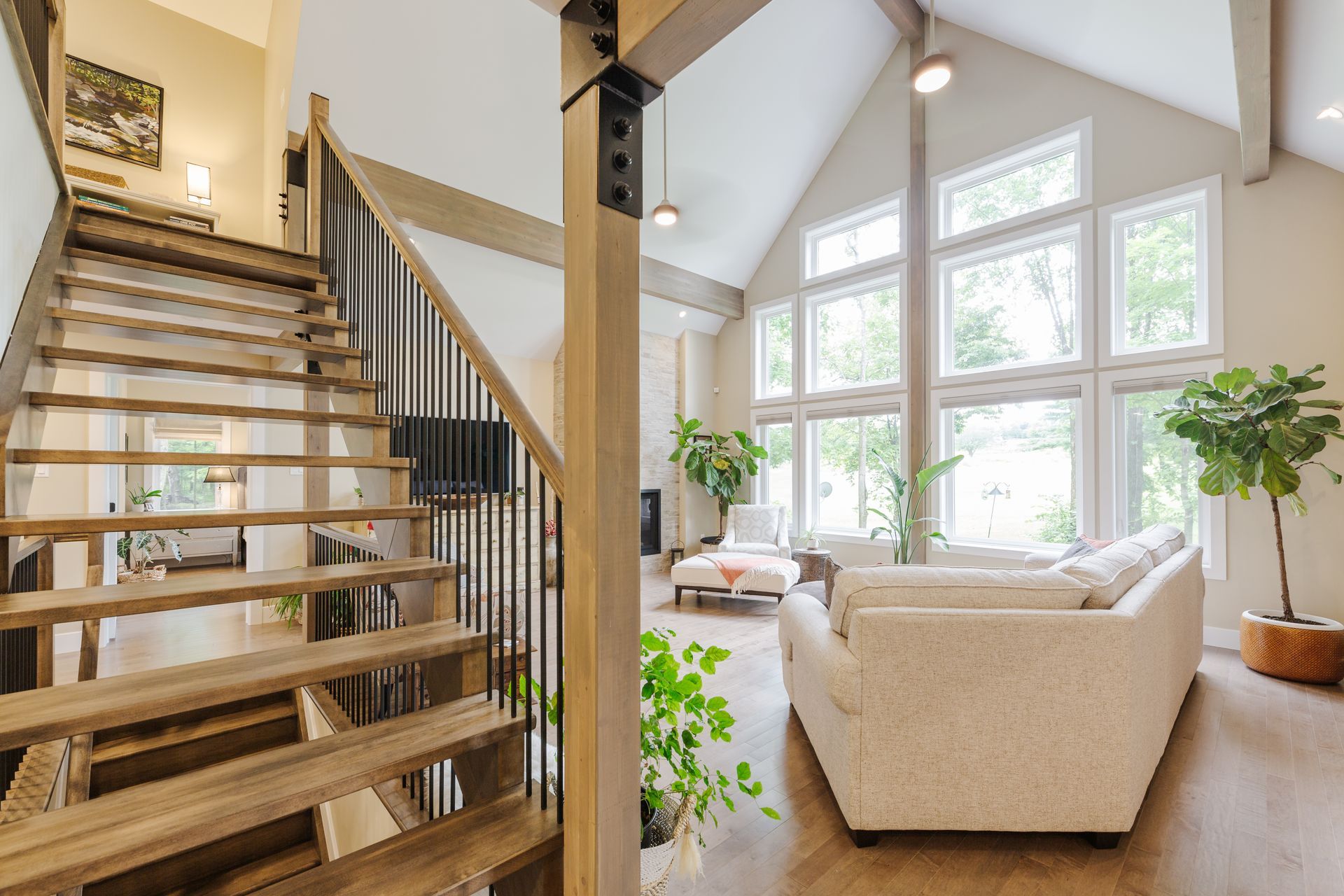
Colour Placement Matters

Beyond the colour itself, where and how you use it makes a difference. Accent walls, painted ceilings, colourful furniture, or vibrant textiles can all influence a room’s vibe. Even lighting plays a role - natural light can brighten colours, while artificial lighting can warm or cool them.

Final Thoughts

Choosing colours for your home isn’t just about aesthetic - it's about setting an emotional tone. Whether you want your space to feel energetic, serene, elegant, or joyful, colour helps communicate that mood. Take your time, consider the function of each room, and trust your emotional response to the shades that speak to you.

By Barbara Emami August 25, 2025
How Plants Can Improve Your Home Without a Green Thumb You don’t need to be a gardening expert to enjoy the beauty and benefits of plants in your home. Even a single leafy addition can breathe life into a space, improving mood, air quality, and overall style with no meticulous care required. Instant Warmth and Personality Plants have a unique ability to make a space feel more alive and inviting. A leafy fern in the corner, a succulent on a windowsill, or a potted palm beside the sofa instantly softens hard lines and adds an organic touch. They bring movement, texture, and color into a room, making it feel less static and more welcoming. Air-Purifying and Mood-Boosting Even low-maintenance plants can contribute to fresher air. While you won’t turn your home into a rainforest oxygen factory, certain plants like snake plants and peace lilies can help reduce toxins and increase humidity. Studies have also shown that simply being around greenery can lower stress, improve focus, and lift your mood, making plants a natural form of wellness décor. Low-Maintenance Options for Beginners If you lack a green thumb, choose hardy plants that thrive on neglect. Snake plants, ZZ plants, pothos, and succulents can survive with minimal watering and adapt to different light levels. Many of these only need attention every couple of weeks which makes them perfect for busy lifestyles or forgetful caretakers. You can also opt for potted herbs like rosemary or mint, which not only look good but can enhance your cooking. Even if they don’t last forever, replacing them seasonally keeps your space fresh and dynamic. Styling with Plants Beyond their health benefits, plants are versatile design elements. A tall fiddle-leaf fig can act as a statement piece, while trailing pothos can soften shelves or bookcases. Grouping plants of varying heights creates visual interest, and choosing pots that complement your décor adds another layer of style.  You don’t have to be a plant whisperer to enjoy their magic. By choosing forgiving varieties and placing them thoughtfully, you can reap the benefits, beauty, calm, and a touch of nature without the stress of complicated care.
By Barbara Emami August 22, 2025
Art in a room is more than decoration it’s a silent storyteller, mood-setter, and personality-revealer. The right piece can transform a space instantly, shifting it from calm to energizing, intimate to expansive, playful to contemplative. In interior design, art is one of the most powerful tools for shaping how a room feels, because it communicates directly with emotion. Why Art Has Such Emotional Impact Unlike furniture or architecture, which are often judged for their function, art is experienced almost entirely through feeling. Color, form, subject matter, and even scale trigger subconscious responses. A large abstract in deep, moody blues can create a sense of serenity or introspection, while a vibrant piece bursting with reds and oranges can energize and excite. Art also connects to memory and personal associations. A photograph from a favorite travel destination can bring warmth and nostalgia, while an expressive portrait can add a human connection to an otherwise minimalist space. Choosing Art to Shape the Atmosphere For Calm & Tranquility: Soft palettes, flowing lines, and nature-inspired imagery tend to relax the eye and soothe the mind. Water scenes, gentle landscapes, or minimal abstract works can help create a sanctuary-like environment. For Energy & Dynamism: Bold colors, sharp contrasts, and graphic patterns can make a space feel more alive and invigorating. These are perfect for creative studios, home gyms, or social living areas. For Drama & Sophistication: Large-scale pieces with strong contrast, dark tones, or striking compositions can make a bold statement, especially in entryways or dining rooms where you want an impactful first impression. Placement as a Mood Tool Where you place art matters as much as the art itself. A piece hung over a fireplace or sofa becomes a focal point, setting the tone for the entire space. Smaller works clustered in a gallery wall can create a sense of intimacy and personality, while a single oversized piece in a minimal room can feel powerful and commanding. Lighting also plays a role. Soft, warm lighting can make art feel inviting and romantic, while cool, bright lighting can highlight details and sharpen a piece’s impact. Personal Connection Matters Ultimately, the art that evokes the most powerful mood is the art that resonates personally. A piece you love, that tells your story or reflects your values, will always bring more authenticity and emotional depth to a room than something chosen solely for matching colors. 
By Barbara Emami August 22, 2025
Juxtaposition in interior design is the deliberate placement of contrasting elements side by side to create visual interest, highlight differences, and evoke emotion. It’s not just about mixing styles or colors, it’s about using contrast as a tool to bring energy, depth, and narrative into a space. When done well, juxtaposition transforms rooms from ordinary to unforgettable. What Juxtaposition Means in Design In simple terms, juxtaposition is the art of “this next to that”, pairing elements that are different in scale, texture, shape, color, style, or era. The human eye is naturally drawn to contrast, so juxtaposed elements encourage people to pause, take notice, and engage with the space. This approach can make a room feel more layered and personal, telling a story about the people who live there. Why Juxtaposition Works Our brains love patterns, but they also love surprises. Too much uniformity can make a room feel flat, while too much chaos feels overwhelming. Juxtaposition strikes a balance by providing both harmony and tension. A sleek, modern sofa paired with a centuries-old Persian rug creates intrigue. A glossy marble table against a backdrop of rustic wood beams sparks conversation. These contrasts stimulate the senses and make a space memorable. Ways to Use Juxtaposition in Interior Design Mixing Old and New One of the most powerful forms of juxtaposition is blending antiques with modern pieces. A minimalist dining table surrounded by vintage chairs, or a contemporary light fixture hanging above a reclaimed farmhouse table, creates an interplay between time periods that feels both grounded and fresh. Contrasting Textures Texture contrast adds depth and tactile richness. Imagine pairing a plush velvet sofa with a raw, exposed brick wall, or a sleek glass coffee table on top of a chunky wool rug. The softness plays against the roughness, and the glossy plays against the matte, giving the room a richer sensory experience. Color Opposites Color theory offers endless opportunities for juxtaposition. Placing complementary colors like deep navy with warm orange can create vibrancy, while high-contrast neutrals like black and white add drama. Even subtle contrasts, such as muted tones against a single bold accent color, can have a striking effect. Mixing Shapes and Forms Geometric and organic shapes work beautifully in juxtaposition. A round mirror above a rectangular console table, or curvaceous chairs flanking a sharp-edged desk, creates visual tension and balance. This approach helps a room feel dynamic rather than static. Balancing Scale Playing with proportions can make a space feel more engaging. A large-scale art piece above a small reading nook, or an oversized pendant light over a petite table, draws the eye and adds personality. High-Low Styling Pairing luxury pieces with affordable finds creates a layered, lived-in aesthetic. A designer sofa with thrifted side tables, or a high-end chandelier above a DIY kitchen island, makes a space feel curated rather than showroom perfect. The Subtle Side of Juxtaposition Not all contrasts need to be bold. Sometimes, the most sophisticated interiors use gentle juxtapositions, like slightly mismatched wood tones, or combining glossy and matte finishes in the same color palette. These quiet contrasts add depth without shouting for attention. Tips for Getting It Right Anchor the space with at least one unifying element, such as a color scheme or repeating material, so the contrasts don’t feel chaotic. Edit with intention - too many contrasts in one room can create visual overload. Choose one or two types of juxtaposition to highlight. Let each element breathe - give enough space around contrasting pieces so their differences are noticeable and impactful.