By Barbara Emami
•
March 9, 2026
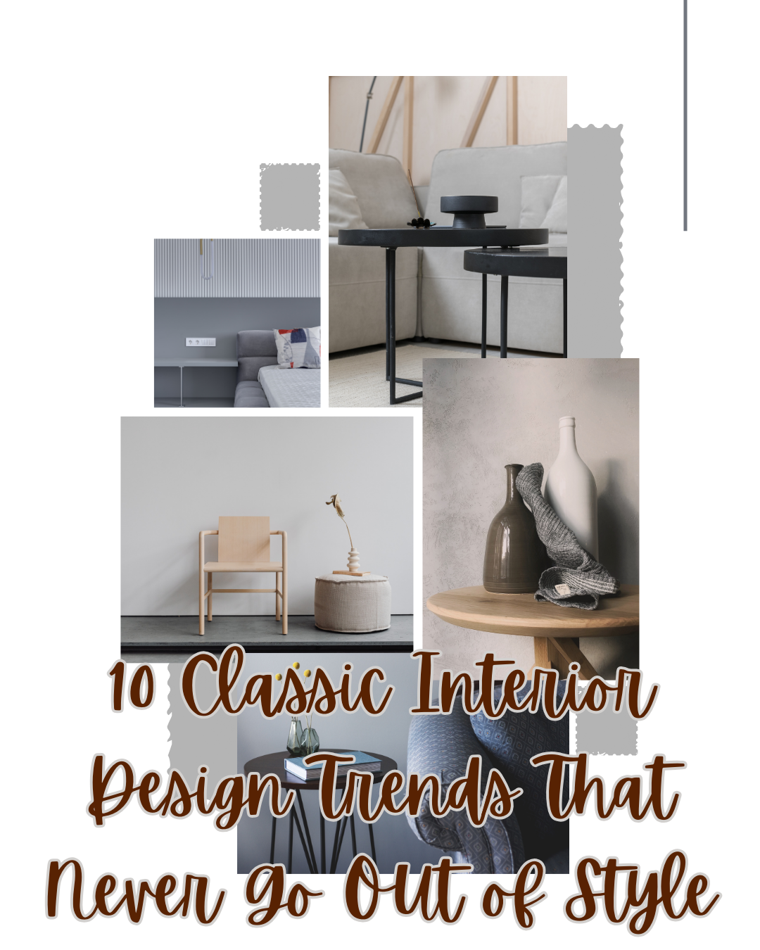
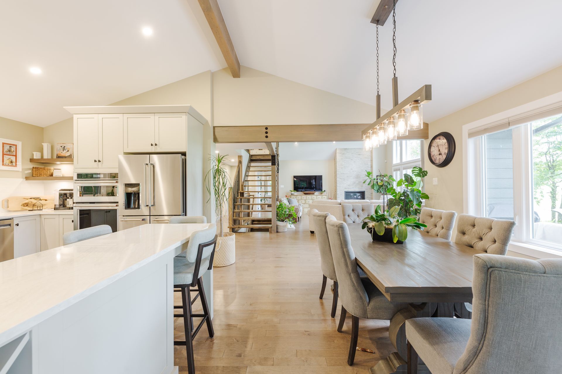
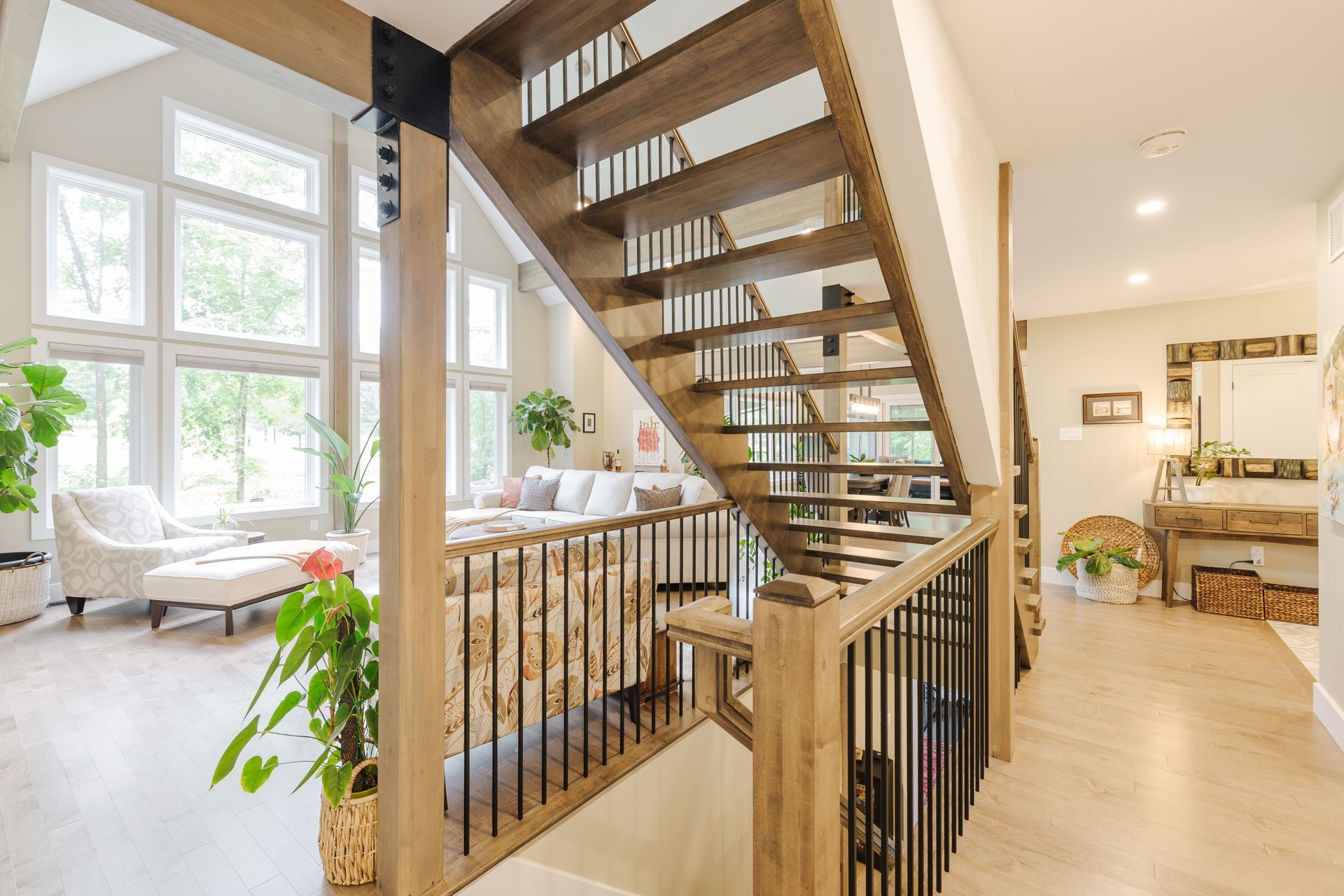
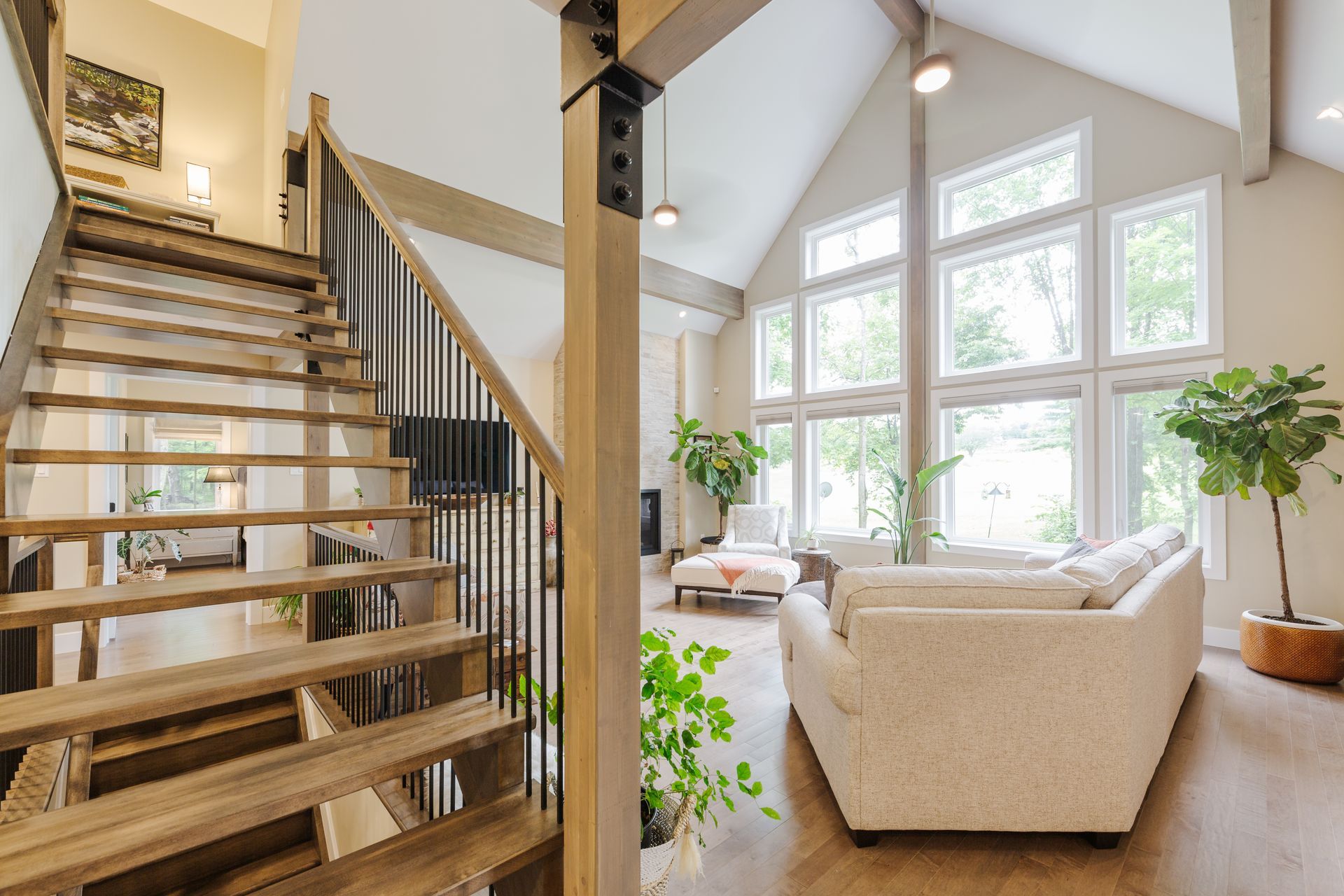
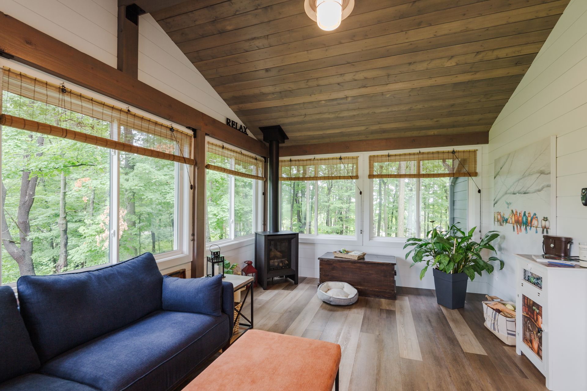
Interior design trends come and go, but some styles stand the test of time. Classic interior design trends offer a sense of permanence, elegance, and balance that continues to inspire homeowners and designers year after year. While modern influences may shift colour palettes or materials, these foundational design principles remain timeless. If you’re planning a home refresh or renovation, incorporating classic design trends ensures your space will feel sophisticated and relevant for years to come. Below are ten enduring interior design trends that continue to define beautiful homes. 1. Neutral Colour Palettes Neutral tones are the backbone of classic interiors. Shades such as soft whites, warm beiges, greys, and muted taupes create a calming and versatile foundation for any room. A neutral palette allows furniture, artwork, and architectural details to stand out without overwhelming the space. It also provides flexibility, making it easy to update accessories or textiles without completely redesigning the room. Soft neutrals layered with natural textures help create warmth while maintaining a refined aesthetic. 2. Architectural Details and Millwork Timeless homes often feature beautiful architectural details that add character and sophistication. Crown moulding, wainscoting, wall panelling, and coffered ceilings create depth and visual interest. These details instantly elevate a room and add a sense of craftsmanship that modern minimalist spaces sometimes lack. Even simple trim upgrades can dramatically improve the overall look of a home. Architectural details are one of the most effective ways to bring a classic design feel into newer homes. 3. Natural Materials Classic interiors celebrate the beauty of natural materials. Wood, stone, marble, linen, and wool are commonly used because they bring texture, durability, and authenticity to a space. Hardwood flooring remains one of the most sought-after design elements, while stone countertops and marble accents add elegance and longevity. Natural materials age gracefully, developing character over time while maintaining their timeless appeal. 4. Statement Lighting Lighting plays a crucial role in classic interior design. Instead of relying on a single overhead fixture, timeless interiors use layered lighting to create ambiance and functionality. Chandeliers, wall sconces, and table lamps help distribute light throughout a room while also acting as decorative features. Statement lighting fixtures, particularly over dining tables or in entryways, create a focal point that enhances the overall design. 5. Balanced Furniture Layouts Symmetry is a key element of traditional interior design. Balanced furniture arrangements create a sense of harmony and order that feels comfortable and visually pleasing. For example, a pair of armchairs opposite a sofa, matching table lamps, or symmetrical built-ins around a fireplace can create a structured and welcoming environment. This balanced approach to layout helps rooms feel cohesive and thoughtfully designed. 6. Quality Over Quantity Classic design prioritizes well-crafted furniture and fewer, more meaningful pieces. Investing in quality furniture ensures longevity while maintaining the elegance of a space. Solid wood tables, tailored upholstery, and handcrafted cabinetry are examples of pieces that never go out of style. Rather than filling a room with many items, classic interiors focus on curated selections that offer both beauty and function. 7. Timeless Patterns Certain patterns remain popular across generations. Stripes, florals, plaids, and subtle geometric designs are commonly used in upholstery, wallpaper, and textiles. When used thoughtfully, patterns add personality without overpowering the room. Classic interiors often mix patterns in complementary scales to create depth and visual interest while maintaining a cohesive colour palette. 8. Built-In Storage Beautiful storage solutions are a hallmark of well-designed homes. Built-in cabinetry, bookshelves, and window seats maximize functionality while enhancing architectural interest. Custom storage allows homeowners to maintain clean, organized spaces without sacrificing style. Whether in living rooms, kitchens, or home offices, built-ins add both practicality and timeless appeal. 9. Art and Personal Collections Artwork plays an essential role in classic interiors. Thoughtfully chosen art pieces bring personality, history, and meaning into a space. Gallery walls, framed prints, sculptures, and curated collections help tell the story of the homeowner while adding visual richness. Classic interiors often balance large statement pieces with smaller artworks to create an engaging and layered environment. 10. Layered Textiles Textiles bring warmth and comfort to a room. Rugs, curtains, throw blankets, and cushions help soften architectural elements while adding colour and texture. Layering textiles is especially important in living rooms and bedrooms where comfort is key. Natural fabrics such as cotton, linen, wool, and velvet enhance the tactile experience of a space and contribute to the timeless feel of classic interiors. Creating a Home That Lasts While design trends evolve each year, these classic interior design principles continue to guide beautiful and functional homes. By combining neutral foundations, quality materials, thoughtful layouts, and personal touches, homeowners can create spaces that remain stylish for decades. Timeless design isn’t about following trends, it’s about building a home that reflects elegance, comfort, and enduring style.