The Power of Colour
Using Colour Psychology to Transform Every Room
When designing your home, colour isn't just about aesthetics - it's one of the most powerful tools you have to influence mood and emotion. Whether you want a space to feel cozy, calming, or full of energy, the colours you choose will play a central role.
Below, we explore how different colours affect mood and how to use them in each room of your home.
Warm Colours: Creating Comfort and Connection
Best for: Living rooms, dining rooms, kitchens
Warm tones such as reds, oranges, and yellows bring energy and warmth to a space. These colours are often associated with excitement, sociability, and coziness. A burnt orange accent wall can make a large living room feel more intimate, while mustard yellow in a kitchen can stimulate appetite and conversation.
Tip: Use warm tones in communal spaces where you want to encourage interaction and a welcoming feel.
Cool Colours: Calm and Serenity
Best for: Bedrooms, bathrooms, home offices
Cool hues like blues, greens, and soft purples evoke peace and relaxation. These are perfect for rooms where you want to unwind. Pale blue can make a bedroom feel light and breezy, while sage green brings a restorative, spa-like quality to bathrooms.
Tip: Cool tones are great for balancing bright sunlight or creating a tranquil retreat from the outside world.
Neutral Colours: Versatility and Sophistication
Best for: Any room, especially open-plan spaces
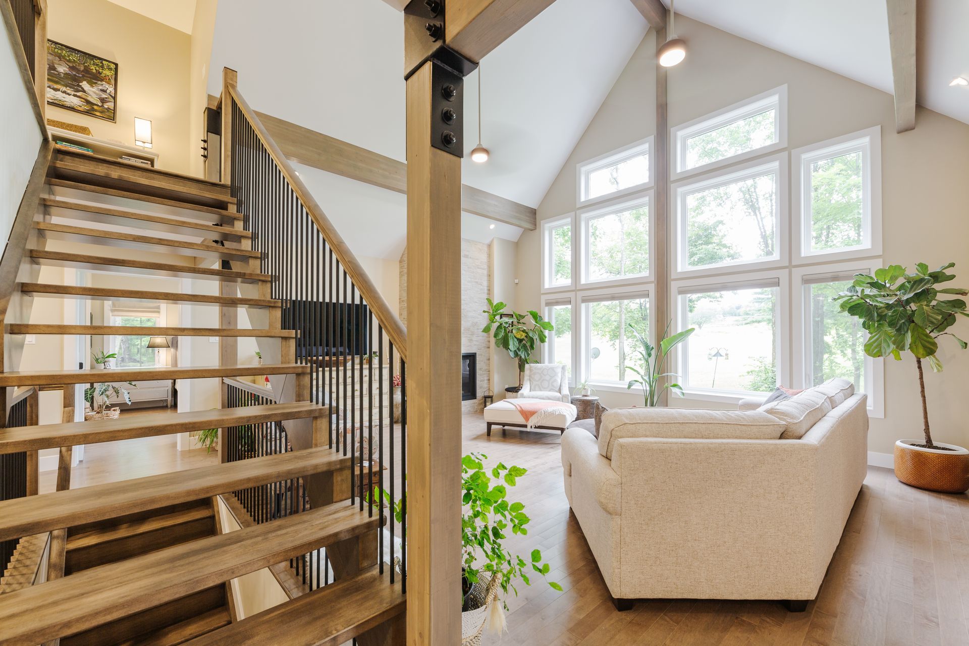
Neutrals like white, grey, beige, and taupe offer flexibility and timeless elegance. They make spaces feel calm and clean, and they allow you to experiment with colour through accessories, furniture, or seasonal decor.
Tip: Choose a neutral base for walls and large furniture pieces, and layer in colour through cushions, rugs, and art.
Dark Colours: Drama and Intimacy
Best for: Bedrooms, dining rooms, studies
Deep hues like navy blue, forest green, or charcoal add a luxurious and intimate feel to rooms. While bold, they can make a space feel grounded and cocoon-like, especially in rooms where relaxation or deep focus is desired.
Tip: Use darker colours in well-lit areas or balance them with lighter furnishings to prevent the room from feeling closed in.
Pastels: Lightness and Cheer
Best for: Nurseries, creative spaces, bedrooms
Soft pastels like blush pink, baby blue, or lavender bring a sense of freshness and playfulness. They work beautifully in children’s rooms or areas where a gentle, uplifting mood is desired.
Tip: Pair pastels with crisp whites and clean lines for a more modern, grown-up look.
How to Use Colour Strategically in the Home
- Accent Walls: Add drama without overwhelming the space.
- Painted Ceilings: Create a cocoon effect or add surprise interest.
- Furniture and Decor: Introduce bold colour without committing to paint.
- Lighting: Remember that natural and artificial light affects how colours appear.
Final Thoughts: Let Colour Guide the Feel of Your Home
Choosing the right colours for your home is about more than just matching décor - it’s about setting the tone for how you want to live. Whether you're after serenity, energy, intimacy, or fun, understanding how colour sets the mood helps you create spaces that truly reflect your personality and lifestyle.